The Weekly KPI Report That Sends Itself, Powered by n8n
Pulling KPIs from Google Analytics and Amplitude, logging them to a spreadsheet, and notifying the team every week, without anyone lifting a finger.

The problem: Monday mornings spent copying numbers
Every Monday morning, someone on the team had to do the same thing: open Google Analytics, pull the session numbers, switch to Amplitude, look up signups and page views, copy everything into a spreadsheet, and post a summary to Slack. Start to finish, about 60 minutes assuming nothing went wrong.
Things always went wrong. Someone would forget. The numbers would not match. A formula would break. And because the process depended on a single person remembering to do it at the right time, any absence meant the report simply did not happen.
The deeper issue was not the time, it was the fragility:
- Three separate data sources - Google Analytics 4, Amplitude, and a Google Sheet that served as the historical record. Each required its own login, its own query, its own format.
- Manual transcription - numbers pulled from one screen and typed into another. Every transfer was an opportunity for error.
- No error visibility - when an API changed, a credential expired, or a data source returned empty, no one knew until someone noticed the numbers looked wrong. By then, decisions may have already been made on bad data.
- Single point of failure - the entire reporting chain depended on one person's Monday morning routine. Holidays, sick days, or a busy start to the week meant no report.
We replaced the routine with a system.
How it works
The KPI Reporting System is a scheduled workflow that runs every Monday at 8 AM. It pulls metrics from Google Analytics 4 and Amplitude, validates the data, appends it to a Google Sheet for historical tracking, and posts a formatted summary to Slack complete with error handling that alerts the team if any data source fails.
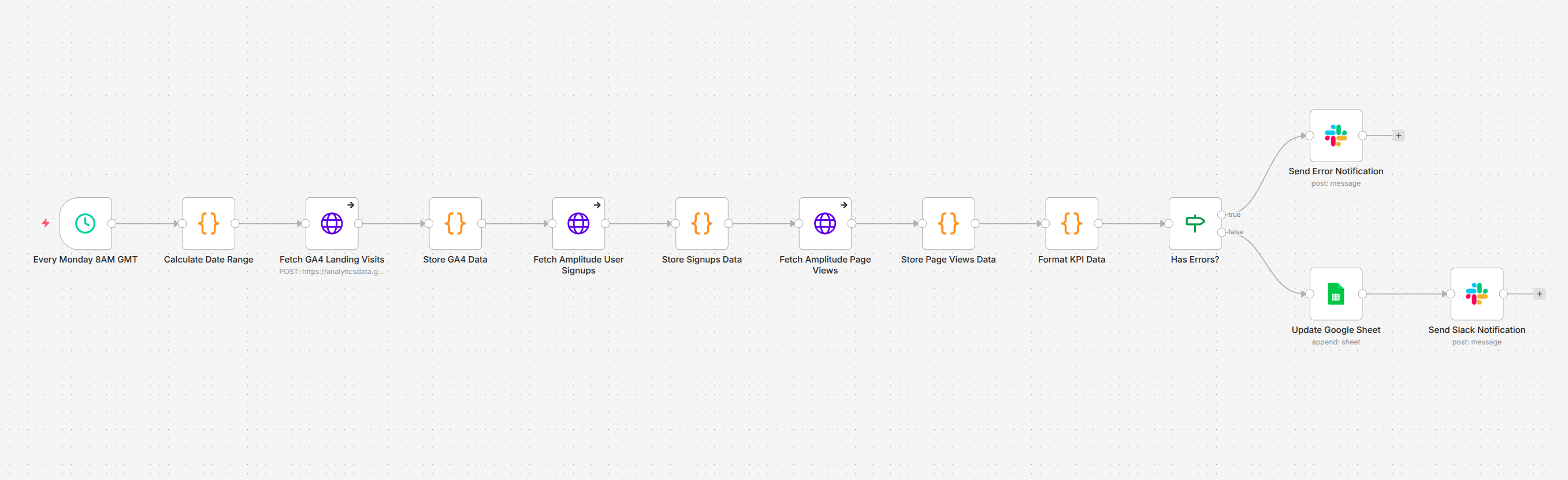 Image 1 - The weekly KPI reporting pipeline
No one opens an analytics dashboard. No one copies a number. No one posts to Slack. The report arrives on schedule, every week, with the same structure and the same reliability.
Image 1 - The weekly KPI reporting pipeline
No one opens an analytics dashboard. No one copies a number. No one posts to Slack. The report arrives on schedule, every week, with the same structure and the same reliability.
Pulls metrics from multiple analytics platforms
The pipeline connects to two analytics platforms in sequence, each queried for the previous seven days.
Google Analytics 4 provides the weekly session count, how many visits the landing page received. Amplitude provides two metrics: unique user signups and unique page views across the web application. The date range is calculated dynamically each time the workflow runs, so the report always covers exactly one week with no gaps.
| Metric | Source | What It Measures |
| Landing Website Visits | Google Analytics 4 | Sessions on the marketing site over the past 7 days |
| User Sign Ups | Amplitude | Unique users who completed registration |
| Webapp Visits | Amplitude | Unique users who viewed pages in the application |
Logs everything to a persistent record
Every week's metrics are appended as a new row in a Google Sheet. Over time, this creates a running historical record week-by-week trends visible at a glance, without anyone maintaining the spreadsheet manually.
The sheet captures the date range alongside each metric, so any row can be traced back to its exact reporting period.
Notifies the team with a formatted Slack summary
Once the data is validated, the workflow posts a structured message to Slack with the week's numbers period, signups, landing visits, and webapp visits formatted for quick scanning.
The team sees the report in their channel at the same time every Monday. No one asks "did anyone pull the numbers?" because the answer is always yes.
Handles errors without failing silently
This is the part that matters most for a system running unattended. Each data source is fetched with error handling enabled, if Google Analytics returns a permission error, or Amplitude returns empty data, the workflow does not crash. Instead, it captures the specific error, routes to a separate notification path, and posts a clear alert to Slack explaining exactly what broke.
The team knows something went wrong the moment it happens, not days later when someone notices a gap in the spreadsheet.
The architecture
The workflow is built as a 12-node linear pipeline in n8n, designed around a simple principle: accumulate data as it flows through, so a failure at any point does not lose what was already collected.
Scheduled trigger - The pipeline fires every Monday at 8 AM. No manual activation required.
Date range calculation - A code node computes the past seven days in the formats each API expects. Google Analytics accepts relative dates natively; Amplitude requires a specific date format. Both are generated from the same calculation.
Sequential data fetching - The workflow queries Google Analytics 4 first, then Amplitude for signups, then Amplitude for page views. After each fetch, a storage node captures the response and checks for errors. This accumulation pattern means that even if the third API call fails, the data from the first two is preserved.
Formatting - A single node extracts the actual metric values from the raw API responses and structures them into a clean, flat format ready for both the spreadsheet and the Slack message.
Error routing - An IF node checks whether any errors were captured during the fetch sequence. If yes, the workflow routes to an error notification. If no, it continues to the success path: append to Google Sheets, then post to Slack.
Dual output - On success, the pipeline writes to two destinations in sequence: the Google Sheet gets a new row with the week's data, and Slack gets the formatted summary.
Before and after
The workflow has been running in production every Monday since deployment.
Before: Someone spends an hour every Monday morning logging into three platforms, running queries, copying numbers into a spreadsheet, double-checking the totals, and posting to Slack. When they are out, the report does not happen. When they make a typo, the record is wrong until someone catches it.
After: The report arrives in Slack at 8 AM every Monday. The spreadsheet grows by one row. If something breaks, the team knows immediately. The person who used to do this manually now spends that hour on work that actually requires their judgment.
Measured results:
- ~4 hours per month reclaimed - 60 minutes of manual work eliminated every week.
- Reports arrive on time, every time - no missed weeks, no delays, no dependency on anyone's availability.
- Copy-paste errors eliminated - numbers flow directly from the API to the spreadsheet and Slack. No human transcription step.
- Errors surface immediately - when a data source fails, the team gets a specific alert within minutes, not a vague realization days later.
Where it goes from here
The current pipeline covers the core weekly cycle. Natural extensions include:
- Additional data sources - connecting CRM metrics, support ticket volumes, or revenue data alongside the existing analytics to build a more complete weekly picture.
- Trend comparison - including week-over-week or month-over-month changes in the Slack message, so the team sees direction and velocity, not just absolute numbers.
- Dashboard integration - pushing the same data to a live dashboard for real-time visibility between weekly reports.
- Threshold alerts - triggering immediate notifications when a metric drops below a defined threshold, rather than waiting for the Monday report to surface the issue.
- Multi-team routing - sending different metric subsets to different Slack channels based on what each team cares about.
Why it matters
KPI reporting is the kind of task that seems too simple to automate until you account for the weeks it gets forgotten, the numbers that get transposed, and the hours that quietly disappear into a routine no one questions. The value of automating it is not just the time saved. It is the consistency, the reliability, and the certainty that the numbers the team sees on Monday morning are the numbers that actually came out of the system.
The KPI Reporting System does not generate insight. It generates trust in the data and frees up the people who used to gather it to focus on what the data actually means.